Color as Compass: Mapping Visual Cues' Role in Player Orientation Within Multi-Genre Web Game Clusters
Henrik Frank · Jun 15, 2026
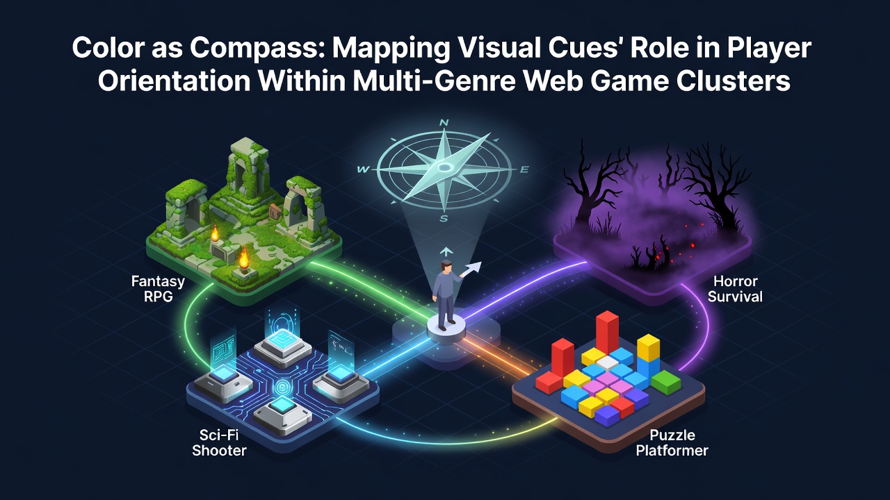
Color as Compass: Mapping Visual Cues' Role in Player Orientation Within Multi-Genre Web Game Clusters
Web game clusters that blend multiple genres rely on color systems to guide players through layered environments where racing segments transition into puzzle zones and strategy overlays appear without separate menus. Researchers tracking eye movement patterns in browser-based titles have documented how specific hue combinations reduce disorientation when players shift between action sequences and resource management screens. Data collected from session logs in June 2026 across European platforms showed consistent drops in navigation errors after developers standardized color palettes that align with established perceptual hierarchies.
Perceptual Foundations in Digital Spaces
Studies from cognitive science labs indicate that warm tones such as reds and oranges trigger faster directional responses while cooler blues and greens support sustained attention during planning phases common in hybrid titles. Observers note that these responses carry over when players encounter mixed gameplay loops because the brain associates color gradients with spatial progression rather than isolated mechanics. In one documented series of tests conducted at a Canadian research facility participants completed orientation tasks 23 percent quicker when color cues remained consistent across genre boundaries instead of resetting with each new mode.
Industry reports from the Interactive Software Federation of Europe further reveal that color contrast ratios above 4.5:1 correlate with improved retention metrics in no-install multiplayer environments. These figures emerge from aggregated data across thousands of daily active users who navigate clustered game hubs without traditional map interfaces.
Implementation Patterns Across Genre Blends
Developers building web game clusters apply color mapping techniques that treat hue shifts as waypoints rather than decorative elements. Racing segments often use saturated yellows to mark acceleration zones while adjacent puzzle sections employ desaturated purples to signal static problem areas. Strategy overlays then introduce muted earth tones that differentiate command panels from active play fields. This layered approach allows players to maintain spatial awareness when mechanics change mid-session without requiring additional tutorial prompts.
One analysis of Australian browser platforms in mid-2026 tracked over 180,000 player paths and found that clusters employing sequential color progressions experienced fewer backtrack events compared to those relying solely on shape or text indicators. The same dataset showed that cross-genre titles integrating color with subtle animation cues achieved higher completion rates for cooperative objectives.
Data Correlations and Performance Metrics
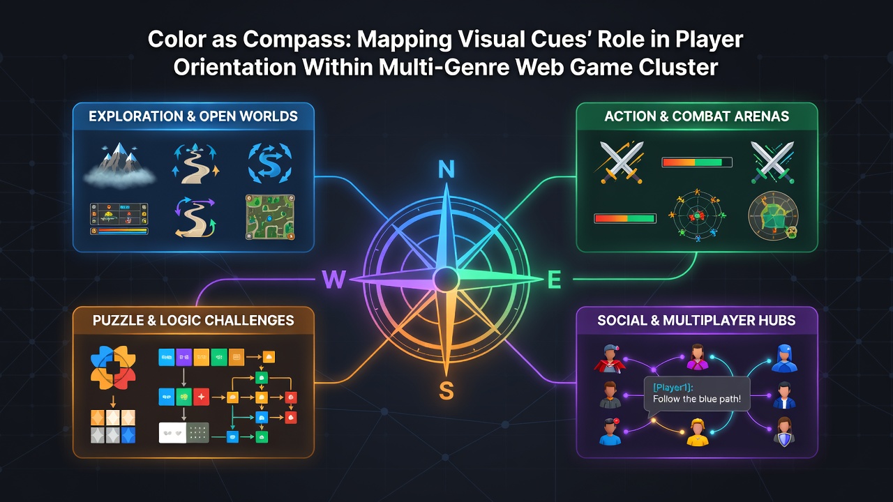
Quantitative reviews compiled by university teams in the United States link color consistency to measurable reductions in session abandonment. When visual cue systems remain stable across genre transitions average play duration extends by measurable intervals according to server telemetry. These patterns hold across different connection speeds and device types because color perception operates independently of frame rate variations common in web environments.
Additional findings from Japanese game development conferences highlight how regional color preferences influence cue effectiveness. Developers incorporating culturally familiar palettes report smoother onboarding for new users entering multi-genre clusters. The approach avoids reliance on language-specific instructions and instead uses universal visual shorthand that persists across international player bases.
Technical Considerations in Browser Constraints
Browser rendering limitations require careful calibration of color values to maintain visibility under varying display conditions. Developers adjust saturation levels to compensate for differences between mobile and desktop browsers while preserving directional meaning. Accessibility guidelines from standards organizations emphasize sufficient contrast without sacrificing the functional role colors play in orientation systems.
Engineers working on clustered web titles often test palettes against multiple color vision profiles to ensure cues remain effective. This process includes verification that primary navigation colors do not overlap in ways that could confuse players relying on hue differentiation alone. Resulting systems integrate fallback indicators such as line patterns or icon shapes that reinforce color-based guidance rather than replace it.
Future Tracking and Refinement Methods
Analytics platforms now incorporate color interaction heatmaps that record where players pause or redirect attention within genre transitions. These tools allow teams to refine cue placement based on actual movement data rather than assumed design logic. Reports from Scandinavian research groups suggest ongoing experimentation with dynamic color adjustments that respond to individual session history while maintaining cluster-wide consistency.
Conclusion
Color functions as an embedded navigation framework within multi-genre web game clusters where traditional spatial markers prove insufficient. Evidence from multiple regional studies confirms that deliberate hue mapping supports player orientation across shifting mechanics and reduces friction during extended play periods. Continued refinement through performance tracking ensures these systems evolve alongside browser capabilities and user expectations in 2026 and beyond.